Park Slope United
United Through Soccer
United Through Soccer
Founded in 2012, Park Slope United (PSU) offers comprehensive soccer education together with a nurturing community to inspire young players with the confidence and character necessary to become excellent soccer players and grow into healthy, well-rounded adults.
Since its founding, PSU has evolved significantly — expanding beyond Park Slope and extending to new audiences, from early ages to adulthood, and new activities, including basketball and fitness.
With this bold vision for the future in mind, PSU engaged Additive to revitalize its visual identity for even greater impact and growth.
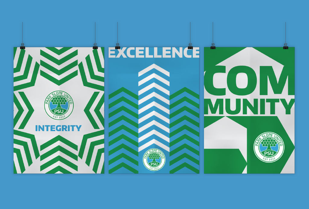
Working together with the leadership team and coaches at PSU, Additive developed a logo and visual identity system that exemplifies PSU’s pillars and purpose, and evokes the enduring value of community, integrity and excellence.
The holding shape of PSU’s logo was designed to echo the shape of a soccer ball while also providing a sense of continuous improvement and a strong, complete community.
The horizon line and the ground below it represent integrity — one of the foundational aspects of character and the pillar that dictates the way we interact with one another. The organization’s communicative name (PSU) sits in the center of this space, symbolically serving as the roots from which the tree springs up. The tree alludes to the club’s beginning in Prospect Park, Brooklyn. The base of the tree evokes constant growth, as well as the patience and practice that leads to excellence, whether on the field, in the classroom or throughout adulthood. The top of the base forms an arrow symbolizing a player’s unending journey toward improvement. The tree expands into branches and leaves that form a far-reaching network — the larger world of PSU’s families, coaches and partners. It shows how PSU’s programs energize and create communities, bringing us all closer together around a shared experience. The branches and leaves are rendered in a hexagonal pattern that evoke soccer balls and nets, with room to expand into other sports and areas of fitness.
Taken together, the logo is not just a piece of design — it is the visual representation of everything PSU stands for: Community. Integrity. Excellence.
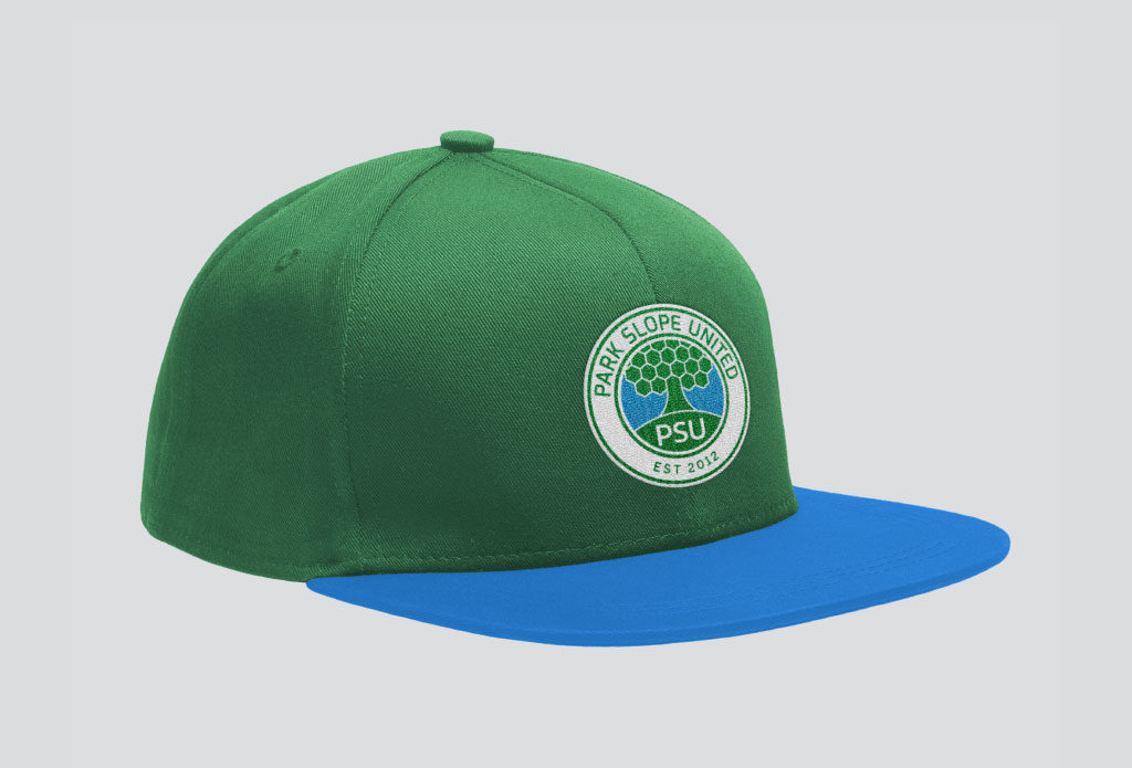
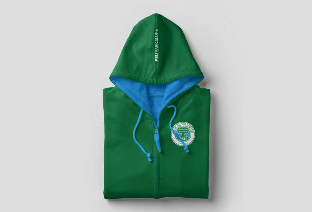
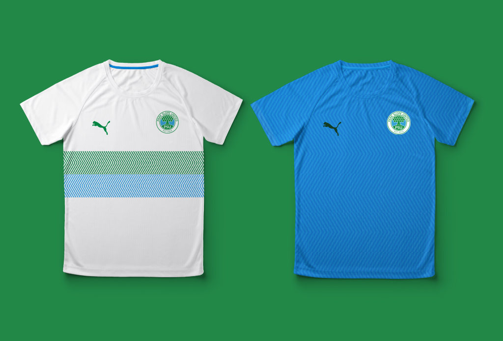
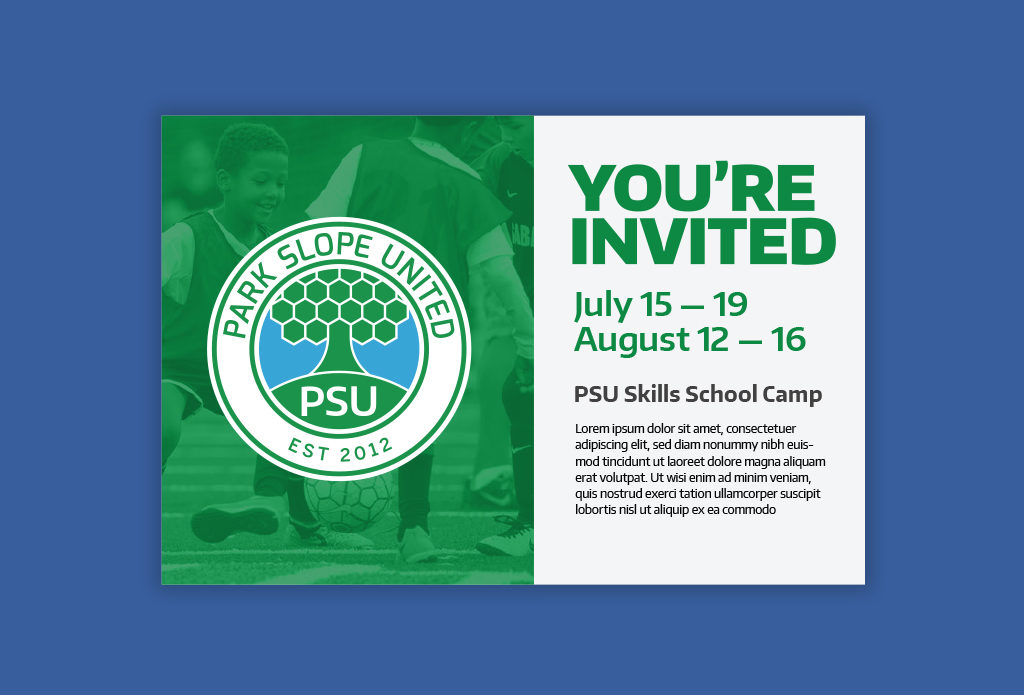
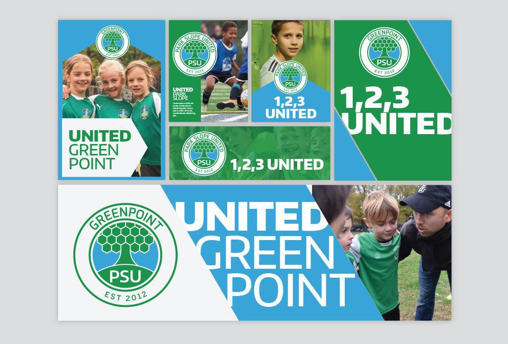
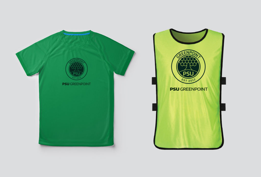
In addition to the logo, Additive developed a broader visual system, including typography, photography style and graphic patterns. The patterns, inspired by the hexagonal shapes in the logo, can be applied across print collateral, digital applications, including social media, and apparel to connote energy, dynamism and community.
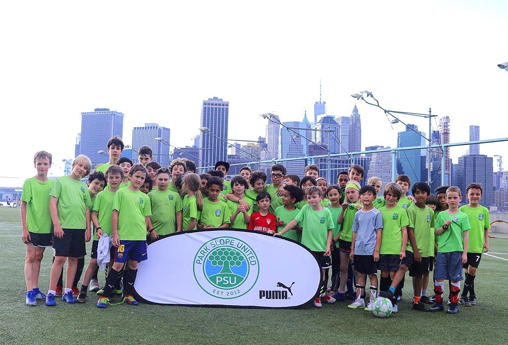
In the summer of 2019, PSU began rolling out its new identity across direct mail and social media and on signage, energizing players, coaches, families and communities. In the fall of 2019, all uniforms, practice jerseys and player gear will be transitioned to the new identity.
“Hayley and her team at Additive worked with the youth soccer club that I lead as we made the transition from a neighborhood-based club to a larger organization, with multiple sports and offerings for the whole family. They listened deeply to all of our objectives, and at every deadline (which they always met) they presented a level of thoughtfulness and depth in their work that I don’t think I’ve ever seen before. Modifying the branding that helped establish our club was energizing, and also a stressful process. Each stakeholder had a strong opinion. Hayley was incredible at counseling me, and valuing my feelings, while providing me tactics to help navigate the process successfully. In a nutshell, I couldn’t imagine a better group to help take an organization into the future.” – Nate Bell, Executive Director, PSU
More Projects